confusion matrix 이해하기
Contents
confusion matrix를 이해하고 예쁘게 표시 해보자.
1. 핵심 요약
- 아래와 같이 confusion matrix를 표시할 수 있음
import numpy as np
import seaborn as sns
import matplotlib.pyplot as plt
from sklearn.metrics import confusion_matrix

# 데이터 준비
y_true = [0, 0, 0, 1, 1, 1, 1, 1, 1, 1]
y_pred = [0, 1, 1, 0, 0, 0, 1, 1, 1, 1]

# confusion matrix
cf_matrix = confusion_matrix(y_true, y_pred)

# annotation 준비
group_names = ["TN", "FP (type 1 error)", "FN (type 2 error)", "TP"]
group_counts = [value for value in cf_matrix.flatten()]
group_percentages = [f"{value:.1%}" for value in cf_matrix.flatten()/np.sum(cf_matrix)]
labels = [f"{v1}\n{v2}\n({v3})" for v1, v2, v3 in zip(group_names,group_counts,group_percentages)]
labels = np.asarray(labels).reshape(2,2)

# 시각화
sns.heatmap(cf_matrix, annot=labels, fmt='', cmap='Blues')
plt.xlabel('Predicted Label')
plt.ylabel('True Label')
2. 코드 설명
🔷 데이터 준비
import numpy as np
import seaborn as sns
import matplotlib.pyplot as plt
from sklearn.metrics import confusion_matrix
실제 값이 y_true 인데 y_pred로 예측한 상황이다.
y_true = [0, 0, 0, 1, 1, 1, 1, 1, 1, 1]
y_pred = [0, 1, 1, 0, 0, 0, 1, 1, 1, 1]
cf_matrix = confusion_matrix(y_true, y_pred)
cf_matrix
array([[1, 2],
       [3, 4]], dtype=int64)
위 실제값과 예측값으로 confusion_matrix를 확인해보면 위와 같이 2x2 array가 나온다.
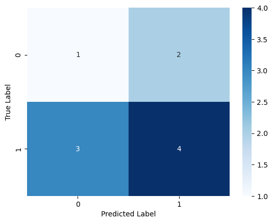
🔷 seaborn 이용해서 시각화
아래와 같이 heatmap으로 표시할 수 있다.
sns.heatmap(cf_matrix, annot=True, cmap='Blues')
plt.xlabel('Predicted Label')
plt.ylabel('True Label')
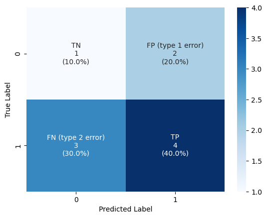
🔷 annotation 예쁘게 해서 시각화
칸 안에 좀 더 많은 정보를 넣어보자.
group_percentages = [f"{value:.2%}" for value in cf_matrix.flatten()/np.sum(cf_matrix)]
group_percentages
['10.00%', '20.00%', '30.00%', '40.00%']
요렇게 각 같의 비율이 얼마인지 확인할 수 있다.
group_names = ["TN", "FP (type 1 error)", "FN (type 2 error)", "TP"]
group_counts = [value for value in cf_matrix.flatten()]
group_percentages = [f"{value:.1%}" for value in cf_matrix.flatten()/np.sum(cf_matrix)]
labels = [f"{v1}\n{v2}\n({v3})" for v1, v2, v3 in zip(group_names,group_counts,group_percentages)]

labels = np.asarray(labels).reshape(2,2)
labels
array([['TN\n1\n(10.0%)', 'FP (type 1 error)\n2\n(20.0%)'],
       ['FN (type 2 error)\n3\n(30.0%)', 'TP\n4\n(40.0%)']], dtype='<U27')
실제 채울 값을 요렇게 준비했다.
준비할 내용을 annot에 넣어준다.
sns.heatmap(cf_matrix, annot=labels, fmt='', cmap='Blues')
plt.xlabel('Predicted Label')
plt.ylabel('True Label')
3. 가설 검정의 오류
통계쪽에서 표현할 때는 실제 현상(True Label) 을 위쪽에 가로로 두고, 나의 판단을 왼쪽에 세로로 두는 경향이 많은 듯 하다.
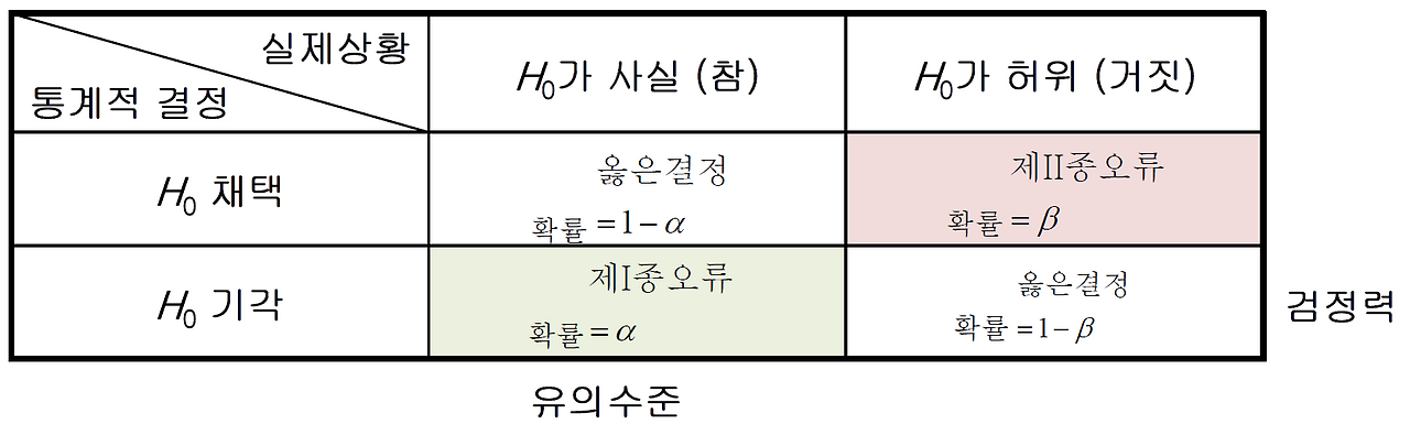
헷갈리니까 요것도 위에서 봤던 confusion matrix에 맞춰서 이해하도록 하자.
아래의 confution matrix와 비교하면 대각 행렬이라고 보면 된다.
- 실제상황(x축)에서 “H0가 허위”(귀무가설이 틀림, 대립가설이 맞음)가 True Label 1을 의미한다.
- “H0가 사실” (귀무가설이 맞음, 대립가설이 틀림)이 True Label 0 을 의미한다.
- 통계적 결정(y축)에서 “H0 기각”(대립가설 채택)이 True 를 예측했음을 의미한다. (Predict 에서 1)
- “H0 채택”(대립가설 채택하지 않음)이 False를 예측했음을 의미한다. (Predict 에서 0)
4. False Negative, False Positive
FN, FP 요런 것들을 이야기 할 때는, 나의 예측이 중심이다.
앞의 F(False) 는 나의 예측이 틀렸다는 의미이다.
뒤의 N(Negative) 는 그때의 나의 예측은 0 이었다는 의미이다.
Reference
- {위키독스} 파이썬으로 데이터 다루기 기초 - confusion_matrix()
- {Medium} Confusion Matrix Visualization
- {scikit-lean docs} sklearn.metrics.confusion_matrix
- {scikit-lean docs} sklearn.metrics.ConfusionMatrixDisplay
- {티스토리-필로홍의 데이터 노트} 1종 오류와 2종 오류란 무엇인가