Unity UI Toolkit 맛보기
Unity의 새로운 UI 시스템인 UI Toolkit을 알아보자
1. 핵심요약
- 유니티에서
UI Toolkit을 새로운 UI 시스템으로 민단다. - 웹을 좀 만져 봤으면 쉽게 적응할 수 있다. (html, css, javascript 각각 uxml, uss, cs 에 대응)
- 안 쓸 이유가 없다면, 써보자!
2. 기본 소개 및 Unity UI와의 차이점
나도 UI Toolkit 이라는 것을 유니티 코리아 유튜브 채널 에서 보고 알게 되었다. 2배속으로 후딱 들어보자.
기존의 Unity UI 와 새로운 UI Toolkit의 차이를 {Unity eBook} User interface design and implementation in Unity에서는 아래와 같이 설명하고 있다.
| item | Unity UI | UI Toolkit |
|---|---|---|
| What is it? | A GameObject-based UI system | A UI system inspired by web technologies |
| Workflow | UI elements are GameObjects inside a Canvas GameObject. They have a Rect Transform component to define position and scale relative to their parent. | UXML files define the UI’s layout, and USS files define the styling. UXML files, also known as Visual Trees, are displayed in the Game view through a UI Document component applied to a GameObject. |
| Authoring tool | In the Scene view, create UI GameObjects in the Hierarchy and nest them to form layout groups. | With UI Builder, create UI Toolkit interfaces consisting of UXML and USS files visually. |
| Styling | Use Prefabs and Nested Prefabs to apply the same styling to many UI elements. You can override the Prefab’s settings from the Scene view. | Use Selectors (USS files) to define styling and apply to many Visual Elements. Override styles with in-line styles in the Visual Tree elements. |
| Key benefits | Integration with other Unity systems, such as Animation, GameObjects, or the position in a 3D space | Performance (retained-mode graphics), scalability with complex UI, customizable materials, different screen sizes and theming; works for Editor UI as well as runtime UI; textureless interfaces |
| Best for… | Simpler UI elements blended in-game or with very specific needs, i.e., damage points coming from a character in a 3D space or a UI element that needs Physics | Recommended for screen overlay menus and HUD elements |
인게임 오브젝트랑 밀접하게 연관되어 있는 UI의 경우에는 애매해 보이는데,
나의 경우는 Unity UI도 제대로 써보지 않았으므로, UI Toolkit을 안 쓸 이유가 없다. 써 보자!
3. 무작정 따라하기
일단 어떤 느낌인지 확인해보자. 아래의 두 유뷰브 정도가 좋아 보였다.
{유튜브} Create Game Menu like a PRO using UI Toolkit
{유튜브} Unity UI Toolkit in 5 Minutes
위 두 개 정도 봤으면, 이제 충분한 것 같다. 직접 간단한 거 하나 만들어 보자.
3.1. 새 프로젝트 준비
새 프로젝트를 만들고, 거대한 프로젝트가 될지도 모르니 멋진 폴더들을 준비하자.
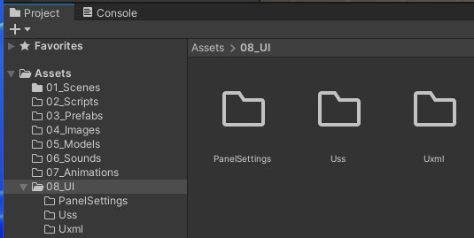
08_UI 폴더 밑에 PanelSettings, Uss, Uxml 폴더를 준비 했다.
3.2. UXML 레이아웃 준비
Uxml 폴더에 UI Document 를 하나 만든다. (Project 윈도우 우클릭 > Create > UI Toolkit > UI Document)
이름은 MainMenu 정도로 해 두자.
해당 파일을 더블 클릭하면 UI Builder 윈도우가 열린다. 인터페이스는 아래와 같다.
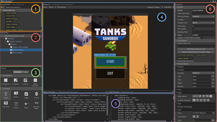
🔷 전체를 담을 Container 준비
② Hierarchy 패널의 MainMenu.uxml 에다가 ③ Library 패널의 VisualElement 를 하나 끌어다 놓자.
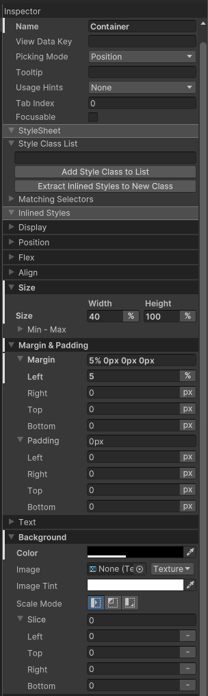
더블 클릭해서 이름을 지정할 수 있는데, 적당히 Container 라고 해 두자.
이제, 실제 게임 화면에서의 배치를 위해 ⑥ Inspector 패널에서 속성 값을 적당히 바꿔 보자. (#Container 고른 상태)
- Size
  - Width: 40%, Height 100%
- Margin
  - Left: 5%
- Background
  - Color : A(alpha) 0.3
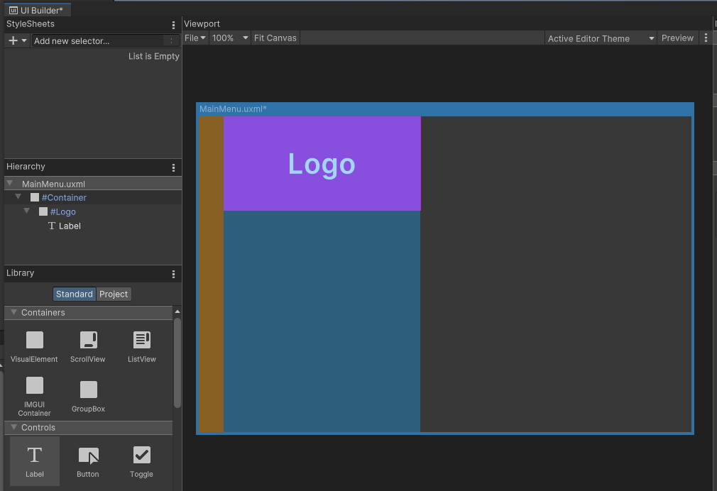
Unset🔷 Logo 부분
VisualElement를 또 끌어와서, #Container 의 자식이 되게 하자. 이름은 Logo.
이미지를 넣어야겠지만, 일단 색깔만 칠해두자.
- Size
    - Height 30%
- Background
    - Color 적당히 붉은 빛
Label 을 하나 끌어다가 #Logo 의 자식으로 두고, “Logo” 라고 Text 를 바꿔준다.
- Label
    - Text : Logo
- Text
    - Font Style: bold
    - Size: 40
    - Color : white
요 텍스트를 가운데에 배치하려면, 부모의 속성 세팅이 필요하다.
#Logo 를 골라 아래 세팅을 추가로 하자.
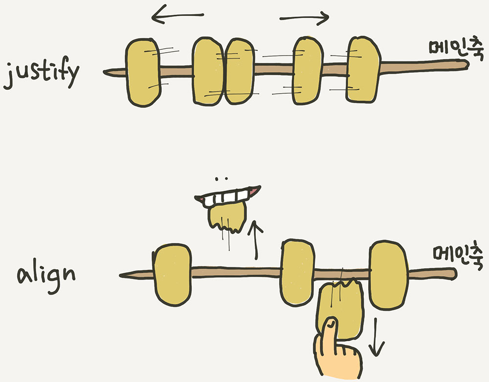
- Align
    - Align Items : center
    - Justify Content : center
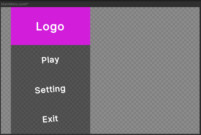
Hierarchy 패널에서 #Container 에 마우스를 올렸을 때의 화면이다.
3.3. 게임에 해당 UI 추가
저장 후 UI Builder 는 잠시 닫아두고, 일단 여기까지를 게임에 붙여보자.
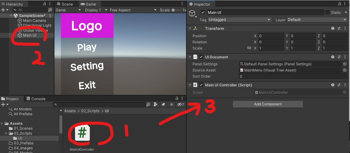
Scene 에 빈 GameObject를 만들고 (이름은 적당히 “Main UI”), UI Document 컴포넌트를 추가한다. (Inspector 패널의 Add Component 버튼 > UI Toolkit > UI Document)
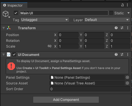
🔷 Panel SettingsPanel Settings이 없다고 뭐라고 한다.08_UI/PanelSettings 폴더로 가서, Panel Settings Asset 를 하나 만들자. (Project 윈도우 우클릭 > Create > UI Toolkit > Panel Settings Asset)
이름은 Default Panel Settings 정도로 두자.
한 화면에 여러 UI 가 있을 때 순서를 어떻게 할 건지, 기본 테마 및 폰트를 어떻게 할건지 등을 세팅하기 위한 에셋으로 보인다.
일단 디폴트로 쓰고 천천히 알아가자.
🔷 UI Document 컴포넌트에 Asset 할당
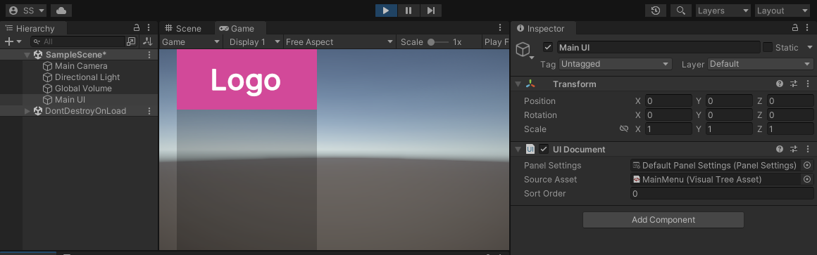
UI Document 컴포넌트의 Panel Settings 에 방금 만든 Default Panel Settings를 할당하고,
Source Asset 에 3.2. UXML 레이아웃 준비 에서 만든 MainMenu 를 할당한다.
이제 우리의 UI가 게임에 나타났다.
3.4. UXML 레이아웃 - 버튼 영역
MainMenu 를 더블 클릭해서 UI Builder 로 편집을 계속하자.VisualElement 하나를 더 #Container 자식으로 추가한다. 더블 클릭해서 이름은 Buttons 라고 하자.
- Flex
    - Grow: 1
위 세팅을 추가하면, 남은 영역을 꽉 채우게 된다.
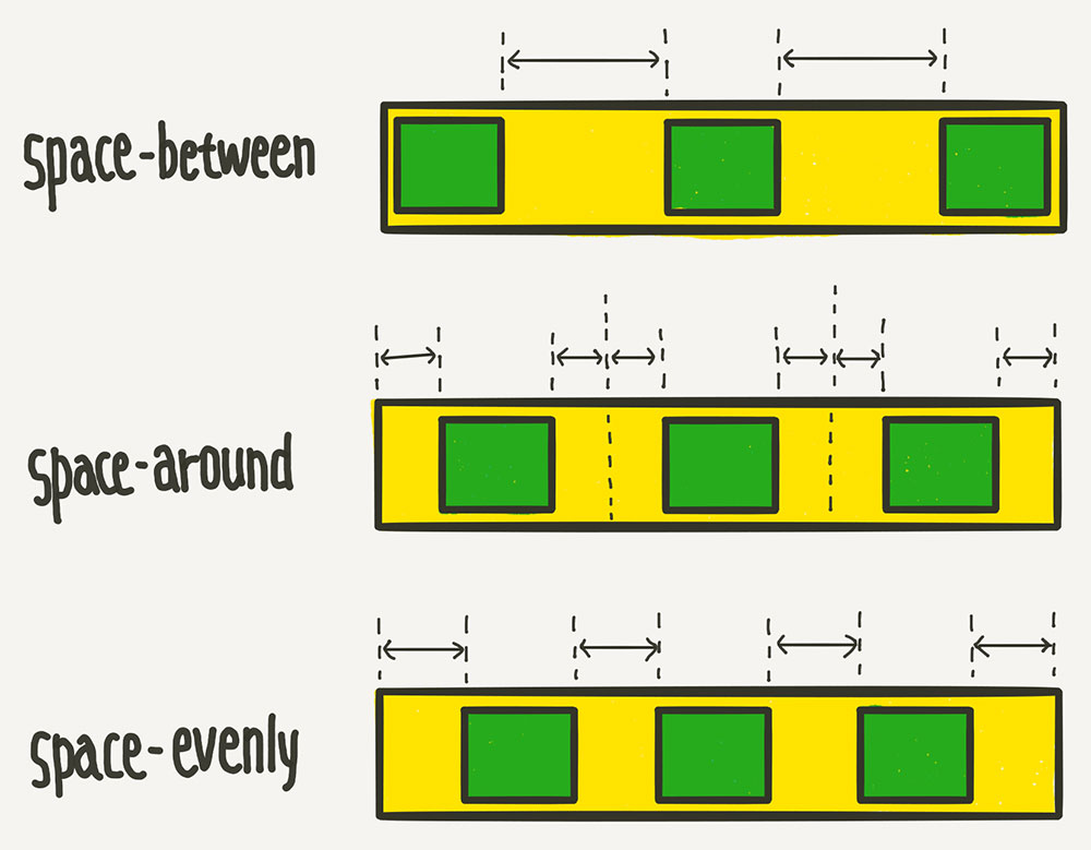
- Align
    - Align Items : center
    - Justify Content : space-around
#Buttons의 자식들을 어떻게 배치할 건지를 위해 위 세팅도 추가하자.
#Buttons 의 자식으로 Button 세개를 추가하고, 각각 PlayButton, SettingButton, ExitButton 라고 이름을 붙인다.
Inspector 패널의 Button - Text 도 각각 “Play”, “Setting”, “Exit” 로 바꿔준다.
이제 #Buttons 의 Align 아래의 Align Items, Justify Content 를 바꿔가면서 버튼들의 배치가 어떻게 달라지는지 확인해보자.
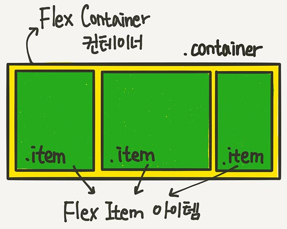
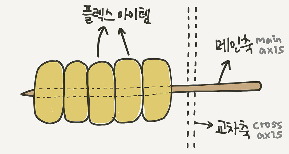
이 부분이 VisualElement의 레이아웃 배치에 근간이 되는 Flexbox 에 대한 부분이다.
{1분코딩} 이번에야말로 CSS Flex를 익혀보자 요 블로그의 내용이 좋았던 걸로 기억한다.
요 내용을 이해해야 UI Toolkit도 마음대로 사용할 수 있으니 제대로 숙지해 두자.
3.5. USS로 스타일링
이제 버튼들에 스타일을 적용해 보자.
🔷 버튼 항목에 클래스 지정#PlayButton, #SettingButton, #ExitButton 에 menu-button 이라고 class 를 지정 해 준다.
Heirarcy 패널에서 해당 버튼을 고른 상태에서 Inspector 패널의 Style Class List 에 원하는 키워드를 추가하면 된다. USS 파일에서 여기서 지정한 class 단위로 스타일을 지정한다.
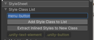
.menu-button 이 추가 되었다.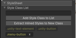
🔷 USS 파일 추가
StyleSheets 패널의 + 버튼을 눌러 USS 파일을 추가할 수 있다.
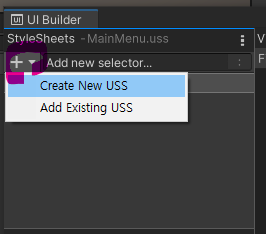
08_UI/Uss 폴더에 MainMenu 라는 이름으로 만들자.
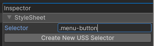
🔷 셀렉터 추가
MainMenu.uss 를 고른 상태에서, Inspector 에서 Selector 를 추가할 수 있다.menu-button 이라는 클래스를 추가해둔 버튼들에 스타일을 적용하고 싶으므로 .menu-button 을 추가한다.
(
.은 문서에 여러개 있어도 괜찮은class,#은 유니크한id를 의미함)
🔷 버튼 스타일링
추가한 셀렉터 .menu-button 에 마우스를 올려보면, 버튼 3개 모두 하이라이팅 되는 것을 볼 수 있다.
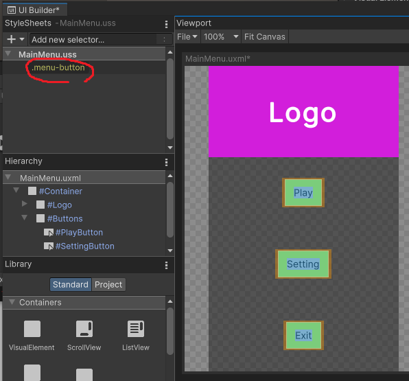
요 셀렉터를 고른 상태에서 속성을 바꾸면, 해당 클래스를 가진 모든 아이템들에 공통으로 적용된다.
- Text
    - Font Style : bold
    - Size: 30
    - Color : white
- Background
    - Color : alpha 0
- Border
    - Color : alpha 0
- Transform
    - Rotate : -5
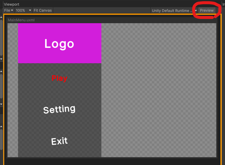
🔷버튼 눌렸을 때 스타일링
이제 버튼이 눌렸을 때의 스타일링을 해보자.
마우스가 올라갔을 때:hover는 모바일에서 의미가 없으니, 눌렸을 때인 :active 에 변화를 줘 보자.
(요런걸 Pseudo-class 라고 하고, {Unity Docs} Pseudo-classes에서 유니티에서 사용가능한 다른 항목들도 확인할 수 있다.)
StyleSheets 패널에서 MainMenu.uss 을 고르고, Inspector 패널에서 .menu-button:active 셀렉터를 추가한다.
생성된 .menu-button:active 을 고르고 아래 속성을 추가한다.
- Text
    - Size: 25
    - Color : red

- Transform
    - Rotate : 0 (다른 값으로 바꿔서 흰색이 표시되게 한 후, 0으로 세팅)
Preview 를 체크해서 버튼을 눌러 보면, 반응을 확인할 수 있다.
3.7. 코드 연결하기
이제 버튼이 눌렸을 때, 실제 실행한 로직을 연결할 차례이다.
02_Scripts/UI 폴더를 만들어서 MainUiController 정도의 이름으로 스크립트를 추가하자. (우클릭 > Create > C# Script)
만든 스크립트를 Scene 의 Main UI 오브젝트에 컴포넌트로 추가해 준다.
이제 버튼이 눌렸을 때 실행될 로직을 연결해 보자.
using UnityEngine;
using UnityEngine.UIElements;

public class MainUiController : MonoBehaviour
{
    private UIDocument _doc;  // 요 스크립트와 같은 게임 오브젝트에 있는 UI Document 컴포넌트 할당용
    private Button _playButton;
    private Button _settingButton;
    private Button _exitButton;

    private void Awake()
    {
        _doc = GetComponent<UIDocument>();

        // 각 버튼의 가져옴
        _playButton = _doc.rootVisualElement.Q<Button>("PlayButton");
        _settingButton = _doc.rootVisualElement.Q<Button>("SettingButton");
        _exitButton = _doc.rootVisualElement.Q<Button>("ExitButton");

        // 콜백 연결
        _playButton.clicked += PlayButtonClicked;
        _settingButton.clicked += SettingButtonClicked;
        _exitButton.clicked += ExitButtonClicked;
    }

    private void PlayButtonClicked()
    {
        Debug.Log("PlayButtonClicked");
    }

    private void SettingButtonClicked()
    {
        Debug.Log("SettingButtonClicked");
    }

    private void ExitButtonClicked()
    {
        Debug.Log("ExitButtonClicked");
        Application.Quit();
    }
}
각 버튼은 UI Builder 에서 지었던 이름(#PlayButton 으로 보이던) 으로 가져올 수 있다.
_playButton = _doc.rootVisualElement.Q<Button>("PlayButton");
Play 해보면, Console 윈도우에 로그가 잘 찍히면 성공이다!
4. 더 알아보기
유니티에서 준비한 훌륭한 샘플(UI Toolkit Sample – Dragon Crashers)이 있으니, 뜯어보고 비슷하게 사용하면 좋을 듯 하다.

Reference
- {유튜브} [유니티 TIPS] 새로워진 유니티 UI Tool kit, 완벽정복 성공?!
- {유튜브} Create Game Menu like a PRO using UI Toolkit
- {유튜브} Unity UI Toolkit in 5 Minutes
- {Unity Docs} Comparison of UI systems in Unity
- {Unity Docs} UI builder - Interface overview
- {Unity Docs} pseudo-class