'Android styling: common theme attributes' 번역
스터디 하면서 샘플 프로젝트 따라 해보다가, 조금 된 예제를 따라하다보니 뭔가 theme 관련해서 마음대로 안되는 상황이 왔습니다.
찾다보니 요 시리즈를 알아두면 되겠다 싶네요.
아래 포스트를 번역한 내용입니다.(안드로이드 공식 블로그인듯 합니다.)
Android styling: common theme attributes
Android styling: common theme attributes
이전 포스트에서 themes와 styles의 차이점과 themes를 이용해서 유연한 style와 layout을 작성하는 방법을 알아보았습니다.
구체적으로 theme attributes를 사용해서 리소스에 접근하는 걸 추천했습니다. 이렇게 함으로써 실제 값을 다르게 할 수 있습니다. (e.g. in dark theme).
즉, 아직 layout이나 style에서 리소스를 직접 접근해서 쓰고 있다면(혹은, 하드 코딩된 값을 쓰고 있다면ㅠㅜ), theme attribute를 쓰는 걸 고려하시기 바랍니다.
<!-- Copyright 2019 Google LLC.
   SPDX-License-Identifier: Apache-2.0 -->
<ConstraintLayout ...
-  android:foreground="@drawable/some_ripple"
-  android:background="@color/blue" />
+  android:foreground="?attr/selectableItemBackground"
+  android:background="?attr/colorPrimarySurface" />
그럼 어떤 theme attribute들이 있을까요? 이번 포스트에서 알아둬야할 자주 쓰이는 theme attribute들을 알아봅시다. Material, AppCompat, platform에서 선언된 애들입니다. 전체 리스트는 아니지만(전체 리스트를 확인하려면 attrs 파일을 확인해보시길 바랍니다.), 제가 항상 쓰는 attribute들입니다.
Colors
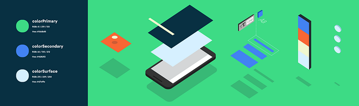
이 색깔들은 Material color system에서 왔습니다. 앱 전반에서 쓸 수 있는 의미있는 이름을 부여하고 있죠. (theme attrs 로 구현되어 있음)
?attr/colorPrimary앱의 브랜드 색상?attr/colorSecondary앱의 두 번째 브랜드 색상. 보통 브랜드 색상의 보색임?attr/colorOn[Primary, Secondary, Surface etc]각 색상에 대비되는 색?attr/color[Primary, Secondary]Variant각 색상에서 약간의 변화?attr/colorSurface컴포넌트들(e.g. cards, sheets, menus)의 바탕을 위한 색?android:attr/colorBackground화면의 바탕색?attr/colorPrimarySurfaceLight themes에서는colorPrimary, Dark theme 에서는colorSurface.?attr/colorError에러 표시를 위한 색
추가로 도움이 되는 색
?attr/colorControlNormalicons/controls이 보통 상태일때 적용되는 색?attr/colorControlActivatedicons/controls이 활성 상태일때 적용되는 색 (e.g. checked).?attr/colorControlHighlightcontrol 강조를 위해 적용되는 색 (e.g. ripples, list selectors).?android:attr/textColorPrimary가장 눈에 띄는 글자 색?android:attr/textColorSecondary두번 째 글자 색
Dimens
?attr/listPreferredItemHeight리스트 아이템의 (최소) 높이?attr/actionBarSize툴바의 높이
Drawables
?attr/selectableItemBackgroundripple/highlight 효과가 필요한 아이템 (전경에도 유용함!!)?attr/selectableItemBackgroundBorderlessripple 효과 필요한 경계선 없는 아이템.?attr/dividerVertical요소들을 수직으로 나눌 때 사용?attr/dividerHorizontal요소들을 수평으로 나눌 때 사용
TextAppearances
Material Design에는 Type scale이 정의되어 있습니다. 앱 전반에서 사용할 텍스트 스타일들의 집합이고, 각 항목들은 theme attribute로 제공됩니다.
다른 폰트로 scale 을 만들려면 Material type scale generator를 확인해 보십시오.
?attr/textAppearanceHeadline1defaults to light 96sp text.?attr/textAppearanceHeadline2defaults to light 60sp text.?attr/textAppearanceHeadline3defaults to regular 48sp text.?attr/textAppearanceHeadline4defaults to regular 34sp text.?attr/textAppearanceHeadline5defaults to regular 24sp text.?attr/textAppearanceHeadline6defaults to medium 20sp text.?attr/textAppearanceSubtitle1defaults to regular 16sp text.?attr/textAppearanceSubtitle2defaults to medium 14sp text.?attr/textAppearanceBody1defaults to regular 16sp text.?attr/textAppearanceBody2defaults to regular 14sp text.?attr/textAppearanceCaptiondefaults to regular 12sp text.?attr/textAppearanceButtondefaults to medium all caps 14sp text.?attr/textAppearanceOverlinedefaults to regular all caps 10sp text.
Shape
Material Design은 shape system을 사용합니다. theme attrs로 구현되어 있고, small, medium, large 컴포넌트들을 위해 각각 정의되어 있습니다.
직접 만든 컴포넌트에 shape appearance를 적용해야 하면, MaterialShapeDrawable을 활용하면 좋을 겁니다.
?attr/shapeAppearanceSmallComponentused for Buttons, Chips, Text Fields etc. Defaults to rounded 4dp corners.?attr/shapeAppearanceMediumComponentused for Cards, Dialogs, Date Pickers etc. Defaults to rounded 4dp corners.?attr/shapeAppearanceLargeComponentused for Bottom Sheets etc. Defaults to rounded 0dp corners (i.e. square!)
Button Styles
Material 에는 세 가지(Contained, Text, Outlined) 타입의 버튼이 있습니다. MDC(Material Componets)는 style을 지정할 수 있는 theme attrs를 제공합니다.
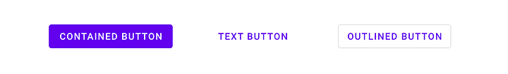
?attr/materialButtonStyledefaults to contained (or just omit the style).?attr/borderlessButtonStylefor a text style button.?attr/materialButtonOutlinedStylefor outlined style.
Floats
?android:attr/disabledAlphaDefault disabled alpha for widgets.?android:attr/primaryContentAlphaThe alpha applied to the foreground elements.?android:attr/secondaryContentAlphaThe alpha applied to secondary elements.
App vs Android namespace
어떤 attribute는 ?android:attr/foo를 참조하고 어떤 건 ?attr/bar 요렇게 되어 있습니다. 앞의 것은 Android 플랫폼에 정의되어 있어서 android를 붙여야 합니다. (layout에서 view attribute를 android:id로 접근하는 것과 비슷).
안 붙은 녀석들은 앱에 포함되는 static library(i.e. AppCompat or MDC)에 정의되어 있어서, namespace가 필요 없습니다. (layout에서 app:baz를 사용하는 것과 비슷)
어떤 element들은 플랫폼과 라이브러리 양쪽에 정의되어 있습니다(e.g. colorPrimary). 이런 경우에는 모든 API level에서 사용할 수 있는 non-platform 버전을 사용하십시오. 백포팅을 위해서 그렇게 라이브러리에 중복 선언되어 있는 것입니다. 위쪽에서도 non-platform 버전들을 언급했습니다.
prefer non-platform attributes which can be used on all API levels
More Resources
thee attributes 전체 리스트는 아래에서 확인하세요.
Material Design Components:
Do It Yourself
theme으로 변화를 주고 싶은 항목이 theme attribute에 없는 경우도 있습니다. 걱정 마세요… 직접 만드시면 됩니다!
Google I/O app에서 컨퍼런스 세션 리스트를 두 화면에서 보여주는 예제입니다.
거의 비슷한데 왼쪽에는 시간이 들어갈 공간이 필요하고 오른쪽에는 그렇지 않습니다. 구현을 위해서 theme attribute을 이용했습니다. layout 하나로 두 화면을 나타낼 수 있었죠.
- attrs.xml에 theme attribute 정의
<!-- Copyright 2019 Google LLC.
   SPDX-License-Identifier: Apache-2.0 -->
<attr name="sessionListKeyline" format="dimension" />
- 다른 테마에 다른 값 제공
<!-- Copyright 2019 Google LLC.
   SPDX-License-Identifier: Apache-2.0 -->
<style name="Theme.IOSched.Schedule">
  …
  <item name="sessionListKeyline">72dp</item>
</style>

<style name="Theme.IOSched.Speaker">
  …
  <item name="sessionListKeyline">16dp</item>
</style>
3. 두 화면에서 같이 사용하는 (각각 위 테마 중 하나를 사용) 하나의 layout에서 해당 theme attr를 사용
<!-- Copyright 2019 Google LLC.
   SPDX-License-Identifier: Apache-2.0 -->
<Guideline …
  app:layout_constraintGuide_begin="?attr/sessionListKeyline" />
Question (mark) everything
어떤 theme attribute들이 사용 가능한지 알아둬야, layout, style, drawable을 작성할 때 사용할 수 있습니다. theme attribute를 사용하면 테마 적용(like dark theme)이 쉬워지고, 더 유연하고 유지보수가 용이한 코드를 작성할 수 있습니다.
더 깊이 알아보기 위해서, 다음 포스트로 가시지요!
Android Styling: prefer theme attributes